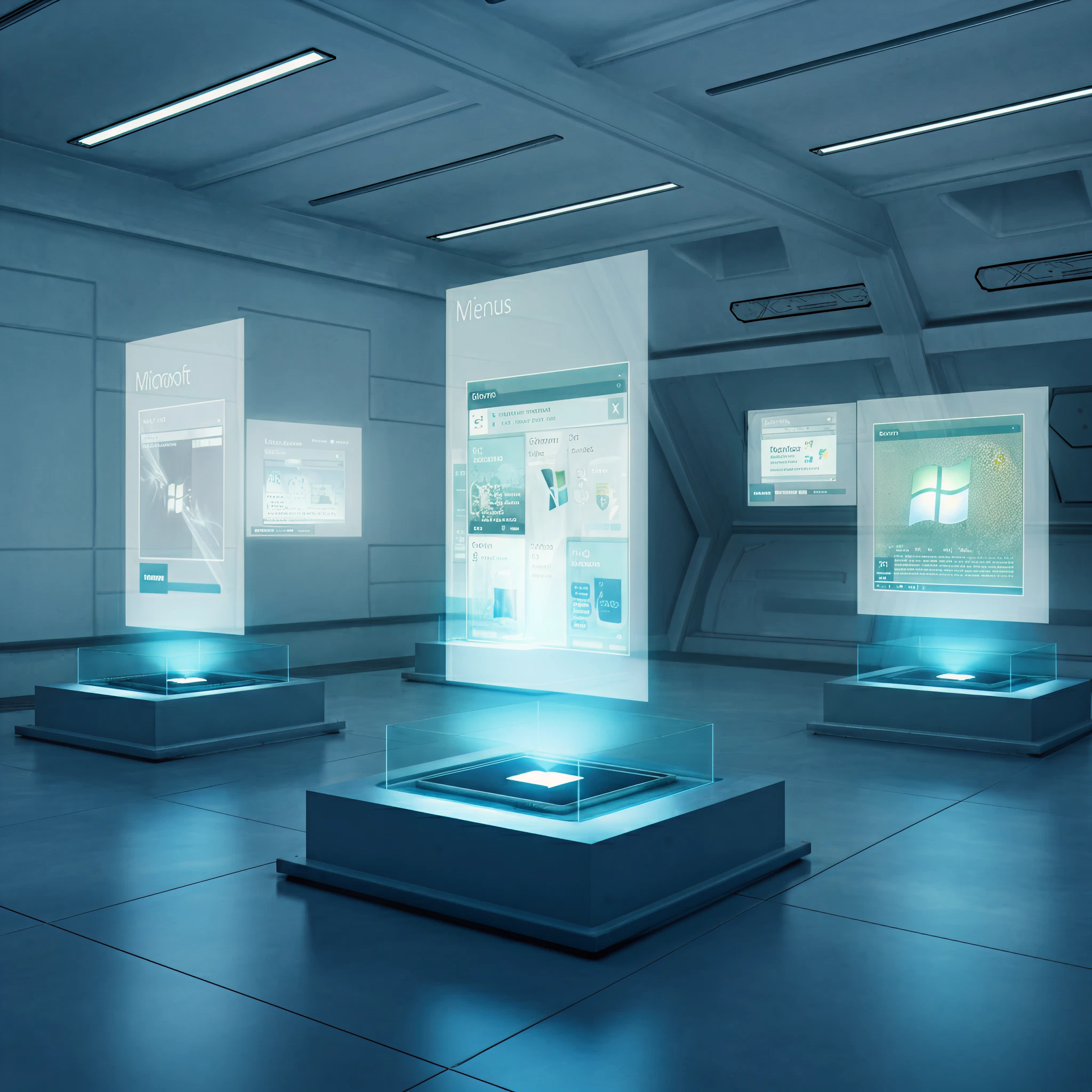
When most of us think about Windows, the iconic Start menu immediately comes to mind. It’s been guiding users for three decades, evolving from its Windows 95 beginnings to the sleek UI we see in Windows 11 today. But what about the design concepts that didn’t make the cut? Microsoft recently pulled back the curtain, revealing fascinating concept designs for the Start menu that never saw the light of day.
Here’s a peek at the bold, futuristic ideas Microsoft explored and the innovative approach behind these vision boards.
The Start Menu Redesign Journey
Microsoft’s design team worked tirelessly to balance innovation with familiarity. The goal was to modernize the Start menu while respecting users’ “muscle memory” developed over decades of interaction. This redesign process involved countless brainstorming sessions, sketches, prototypes, and even co-creation calls with over 300 Windows fans.
With feedback collected through eye-tracking tests and engagement heatmaps, Microsoft filtered through bold concepts to ensure the final design was functional, user-friendly, and customizable.
The Rejected Concepts
Now, onto the designs that didn’t make it—but showcase how ambitious the team’s ideas were:
1. “For You” Widget Integration with a Rounded Menu
Imagine a Start menu that feels more like a modern dashboard, where widget-like cards show your Teams meetings, recent YouTube videos, and recently opened files. This design had a rounded aesthetic, offering a sleek and touch-friendly design that feels almost futuristic.
Why It Wasn’t Selected
While visually appealing, it was deemed too much of a departure from the classic Windows Start menu. The functionality risked overwhelming users.
Visual Representation:
2. App Categories at the Forefront
Another prototype showed a minimalist menu centered around categorized app groups. This stripped-down approach would have simplified organization for power users by focusing solely on app discovery and file navigation without distractions.
Why It Wasn’t Selected
It leaned too heavily on categorization, reducing core functionalities many users expect from the Start menu, like quick access to personal files or recommended apps.
Visual Representation:
3. Vertical Landing Page Concept
One bolder concept replaced the traditional Start menu entirely with a full-screen vertical interface. It separated key functionalities into clear sections like shortcuts, app lists, recent Android phone interactions, and creation tools.
Why It Wasn’t Selected
While the landing page idea was highly dynamic, it alienated users familiar with a compact Start menu. Additionally, such a significant overhaul clashed with the need to avoid disrupting established workflows.
Visual Representation:
4. The Full-Vertical Scroller
This daring prototype took the entire Start menu vertical, incorporating infinite scrolling for navigating app categories, files, and tools. It looked like a never-ending, app-packed hub for power users working on larger displays.
Why It Wasn’t Selected
Although immensely functional for high-end monitors, it felt cumbersome on smaller screens and laptops, making it impractical for millions of users across the Windows ecosystem.
Visual Representation:
Lessons from the Process
Each design concept offered unique ideas that shaped the final version of Windows 11’s Start menu. There’s no doubt these rejected ideas reflect a willingness to experiment and think beyond convention. From widget-like designs to full-screen transformations, Microsoft’s team demonstrated a forward-thinking approach that considered how work, connectivity, and interaction evolve in the world of technology.
Still, every idea came with challenges, and through extensive testing, the design team ultimately maintained the familiar Start menu framework while providing exciting updates like the ability to disable the recommended feed.
Why Design Matters
For Microsoft, the Start menu wasn’t just about utility but user trust and nostalgia. By sharing these concepts, the company offers a rare glimpse into their design-thinking philosophy and decision-making process.
These ideas show the delicate balance between innovation and usability that companies must maintain, especially when addressing such a central feature to user experience.
A Closer Look at the Final Windows 11 Start Menu
While these rejected concepts didn’t make it into the final release, the current Start menu in Windows 11 pays homage to these inspirations. It blends clean aesthetics with advanced functionality, offering users customizability, convenience, and plenty of room for productivity.
Wrapping Up
Microsoft’s creative process reminds us that even the boldest ideas have a role in shaping what comes next. The Start menu concepts showcase the importance of taking risks, staying open to feedback, and, most importantly, listening to users.
Got a favorite concept from the list? Share your thoughts in the comments below!
