After a Decade, Google’s Logo Gets a Refresh
Google, the tech giant synonymous with innovation, has unveiled a fresh update to its iconic branding. This change showcases subtle yet impactful improvements to better align the logo with the needs of modern users. The reimagined visuals of Google’s famous “G” logo aim to improve clarity and consistency across diverse platforms and screens.
Below, we’ll explore what’s changed in the update, why these changes matter, and what they tell us about Google’s vision for the future.
What’s New in Google’s Logo?
The updates to the Google logo may not seem drastic at first glance, but they’ve been carefully designed to enhance visual appeal and functionality. Here’s what’s different:
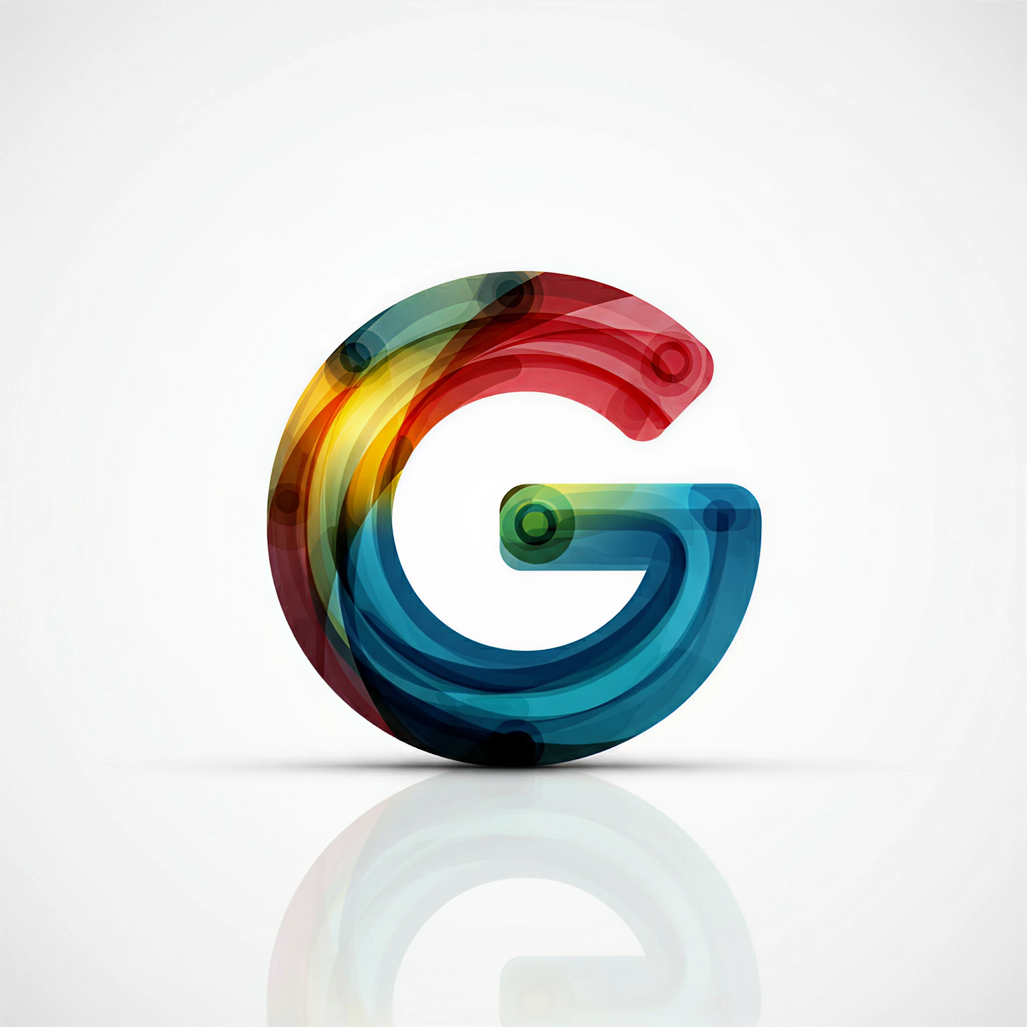
- Subtle Color Adjustments: The iconic red, blue, green, and yellow tones now feature softer gradients for a sleek and contemporary look. These adjustments aim to ensure better rendering on digital and small displays.
- Streamlined Font: Google’s new font balances simplicity with style, providing greater readability and a cleaner aesthetic across all devices.
- Dynamic Scaling: The refreshed design improves adaptability, allowing for seamless scaling while retaining clarity and sharpness, whether displayed on a phone, tablet, or large-scale screen.
- Refined Letter Spacing: Subtle adjustments to spacing create a polished and modern visual style, ensuring greater accessibility and elegance.
!Google Logo Update Comparison/article-new/2025/05/google-logo-update.jpg)
Why Did Google Update Its Logo?
The world of digital design is constantly evolving, and brands must adapt to remain relevant. Google’s logo refresh reflects its commitment to this adaptability and supports these key objectives:
- Commitment to Accessibility: With more users accessing Google across a wide range of devices, the new design ensures easier recognition on smaller screens without losing its impact.
- Consistency Across Platforms: Whether you’re viewing a banner on a website or using the Google Search app on iOS, this logo offers a seamless, unified look.
- Alignment with Innovation: Updating its logo is a symbolic reminder of Google’s continuous drive toward improvement and streamlined, user-centric design.
- Brand Evolution: Small aesthetic tweaks ensure that the Google logo stays fresh and modern while remaining instantly recognizable–a testament to its timeless design principles.
What This Means for the Design Community and Beyond
For tech enthusiasts, marketing professionals, and designers, Google’s decision to update its logo emphasizes the importance of intentional, detail-oriented design. While the changes may seem subtle, they underline the value of accessibility, minimalism, and adaptability in branding.
It’s also a gentle nudge for brands globally to evaluate how user experiences can be improved through thoughtful design adjustments tailored to modern audiences.
Google as an Icon of Evolution
While some may view logo updates as minor, they’re often indicative of broader shifts in a company’s mission, technological advancements, and commitment to design leadership. Google has done exactly that with this refresh.
It’s not just about aesthetics–it’s about setting a new standard for what branding in the digital age can look like. By making functional design changes without compromising recognizability, Google has once again solidified its reputation as a champion of innovation.
What do you think about Google’s updated logo design? Designers and tech enthusiasts, drop your thoughts in the comments section!
Illustrations
To further enhance this piece, the following custom visual assets can be created for the article:
- Before and After Comparison
Side-by-side visuals of the old Google logo versus the updated one, highlighting the gradient colors and overall adjustments.
- Scaling Preview
A dynamic image showcasing how the updated logo adapts seamlessly across different screen sizes (e.g., smartphone, tablet, and desktop views).
- Color Palette Analysis
A visual breakdown of the subtle gradient changes in the new logo compared to the block colors of the previous design.
- Typography Details
A zoomed-in visual highlighting the streamlined font changes and refined letter spacing.
By pairing engaging content with these visuals, this article will better resonate with the tech and design communities while reinforcing the importance of thoughtful design evolution.